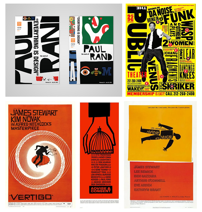
Is it the font, shapes, colors, tone, composition, or imagery? Without a doubt, it encompasses all of these elements. However, there is something more that distinguishes good design from average design. Some people refer to it as the “eye,” which is mostly influenced by experience or inspiration from the designs found in nature. Whether it’s the stunning horizon, the color palette of orchids, the symmetry of a honeycomb, or the smile of the Mona Lisa, it all serves as a reference point for a designer’s taste.
A good design cannot have a bad reference. A beautiful flower gives birth to another beautiful one, something even more pristine. When learning or teaching about graphic design, whether it’s for web or print, it’s easy to get lost in the tools and try to learn a new one every day, adding a few more letters to your resume. However, in pursuit of becoming a good designer, how does one acquire taste?
Developing taste and individuality requires experience, not a crash course that can be taught in a year or a month. It’s as simple as appreciating beauty in the little and big things, accepting it, pausing to think about it, and being inspired by it. While most people pause and say, “Oh, how beautiful!” designers stay there for a few more moments, letting it inspire them, swaying softly towards the muse. Pausing is good enough, as it goes into the subconscious, waiting to evolve and appear when called for in an inspired future execution. That’s when someone says, “Your design feels magical!” and you smile, feeling proud but wondering how you did it in the first place.
It’s crucial for young designers to understand this need that a good design requires from a designer. To develop taste, they need to appreciate beauty before being appreciated themselves. They should keep collecting what inspires them and come back to it. Sometimes, there’s anxiety with young designers who say, “I know what looks good, but I can’t express it as beautifully in my designs.” It’s normal, it’s part of the learning process, and the muse doesn’t come easily. However, those who wait and let it happen without a deadline will eventually meet the deadline.
In practical terms, there is a hack, a shortcut that’s not very short, but it puts some process in place. What young aspiring designers can do is,
Step 1 : Pull the reference to a design software and lock the layer.
Step 2: Create another layer on top of it and try to recreate the design, pixel by pixel, but not by constantly looking at the inspiration. Instead, memorize it and try to design that part of the reference in the exact same location and size on the art board. If the entire reference design is too much to remember, just memorize a part of it. But don’t copy it by looking at it.
You’ll notice that your interpretation of the reference is different from the original design. Keep repeating the process, and eventually, you’ll get better. This trains your mind to produce better designs and create a better balance between elements, shapes, colors, and typography. This is how you develop taste and put it to work. After putting many more years of practice and patience, some fine day someone will pass by and say, “Your design feels magical.”
Bonus tip: All elements that need to go into the layout should not be grouped elements, but independent. Whether it’s text, images, or shapes, free them all, then bring them together as your muse guides you.
Don’t forget to appreciate if you enjoyed this article. You can see my work and follow at https://dribbble.com/MWHDesign